

On the 17th of this month, the SupersizeLIFE blog completed its second full year. Second blogiversary? Is that a thing? Sure. Let’s say it is.
I knew I wanted to make some blog changes for the milestone. Indecisiveness plagued me for a couple months as to the degree of change I wanted. On the one hand, I could change the entire look and functionality of the site. On the other, that’s a lot of work and takes a higher level of skill than I currently have. Plus, I really like the look of the theme I have, called Tulip.

When you lose sight of the goal focus gets blurry. I had to remember that while making decisions about the blog changes.
I shared a few months ago that I am in a Mastermind group. We found each other and formed during the RV Entrepreneur Summit that took me to Fredericksburg, Texas. Our group works in 13-week sessions and currently we are in the middle of our second 13 weeks. My goals for this session focus on driving traffic to the website and increasing followers on social media.
In other words, I want to expand the reach of the website.
Going back to my goals helped me finally make the decision to not radically change the website as I decided it wasn’t wise to split my focus.
Besides, I have to save something grand for future blogiversaries.
What Does That Mean?
It means the changes are subtle. They could easily be missed. And that’s okay. But I thought I’d give you a rundown of the site’s changes. It might come in handy if you are looking for something specific.
The single biggest change is the categories. The categories made such logical sense to me when I created them. So much so, I thought I’d have them forever. Back then I didn’t understand the importance of things like SEO. I didn’t even know what it stood for. Search Engine Optimization, in case you wonder. Basically, it’s how search engines like Google find and index your site. It is a big deal. Especially for someone trying to expand her reach.
Additionally, back then, I envisioned posts continuing in the categories of finances and downsizing. But that hasn’t turned out to be the case.
At the drawing board, I redesigned categories based on what I was actually writing, based on what I was interested in writing about and based on what readers have asked me to write about.
New Categories
You’ll see, three categories:
- Life Before Life on the Road
- Life on the Road
- Supersize Adventures
However, if you click on any of those categories, you won’t go anywhere. This isn’t an error. The reason is because within those categories you’ll see dropdown boxes with more focused subcategories. Those will lead you somewhere.
The subcategories should be self-explanatory. Or, they better be. If not, I definitely did something wrong.
In general, posts before November 2017 are in Life Before Life on the Road. My adventure posts are in Supersize Adventures. If not an adventure, then most posts will be found in Life on the Road.
For the subcategory of Supersize Adventures, I adopted the US Census Bureau’s division of the United States, basically dividing the country into quarters. However, Alaska got its own subcategory since I already had so many posts about the place I spent the last 24 years. Also, if one of the subcategories doesn’t have anything in it, it’s because I haven’t had adventures in that area of the county yet. But no worries. It won’t be long before I make it to every quadrant.
Logo

The photo I sent Elizabeth.
Like the rest of the site, the logo is the same. But different. A fellow Mastermind participant is an amazing artist. I sent a photo of Quill and she turned it into a digital representation of the trailer.
See the solar panels and the air conditioner on top? In between the two is my MaxxFan. See the propane tank holder and the electronic jack unit in the front? The door, tires and windows are in the exact correct place. But my favorite thing has to be the spare tire on the back. I get such a kick out of it. Bringing up the rear like a caboose.
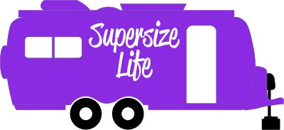
Digitized Oliver I got in return.
Once we had the trailer, we experimented with different layouts. I wanted the trailer incorporated into the words. As you can see, we moved LIFE over to fit in the trailer. We played with ways to represent Supersize and the moment she added the outside glow, I knew we had it. I just love it. It is a tad 1970s hippy or maybe 1980s graffiti. But I don’t care. It speaks to me.
I hope you like it too.
By the way, if you are interested in working with her on your logo or want to see her other art, go to her website Gizillustrations. Her name is Elizabeth. Tell her Supersize LIFE sent you.
Color
I knew the best practices around branding because I studied it as I prepared to launch this site two years ago. But the knowledge in my head wasn’t what I practiced. The biggest example is with color.
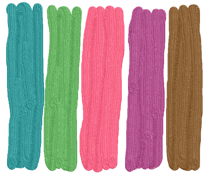
My original color scheme. I spent days getting them just right. What was I thinking? Lovely, but not me.
Initially, I picked a color scheme. The colors were strong but muted. Not sure why I went that way when I adore vibrant colors. Actually,I do know why. They were popular at the time. I thought it was what I was supposed to do if I wanted a successful blog.
But once I had my website up, I loved the clean look of it and all the white space. Plus, except for the text and the boxes in the sidebar, color really wasn’t used. So, all the work of selecting a color scheme was for naught. Just as well since I was never in love with the colors to begin with.
Except for purple. And, here is where I really got in the way of my own best interest. Each new time I posted something with purple (on the site, on social media or in print such as my business cards), I picked a different purple. I judged based on my eye.
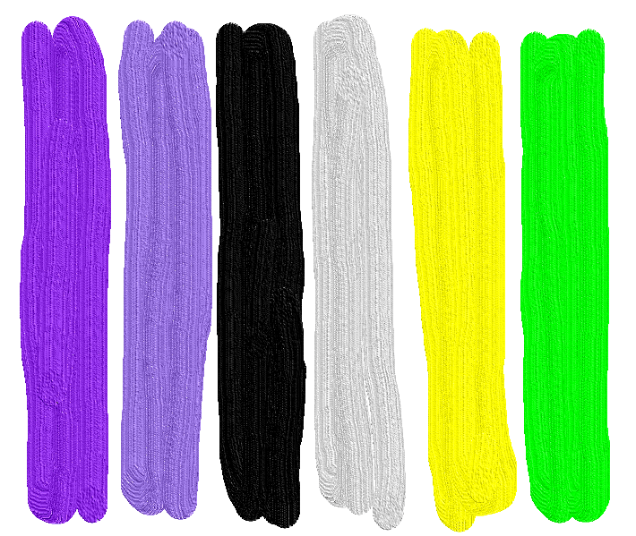
My new color scheme. Much more me. I get happy just looking at them.
The problem was twofold. First and most obvious, inconsistency. Marketing 101: when building a brand, choose your color and stick with it. Second—and this took me a while to realize—no matter how perfect the purple looked on my computer, that didn’t mean your computer showed it the exact same way. Or phone. Or you neighbor’s tablet. It’s almost shocking how wide of a variance exists between devices.
In the end, for this reboot, I finally settled on a purple. Blue Violet. I adore it. And I’m not going to worry about whether you see the exact same thing I see. Or if it’s popular. In fact, I’m sure it’s not. But, I know the hexadecimal notations, also referred to as the hex triplet (that’s geek talk for the red—blue—green byte code for computer programming) associated with each color in my scheme. And I’m sticking to it across all platforms.
Brand consistency: check.
Here’s a sneak peek of one version of the lime logo. This one is outlined in black. Super cool, right?
Side note: when I say all that stuff about hex-this and red-green-blue-that, doesn’t it sound like I know what I’m talking about? Some days, I halfway do know what I’m talking about. I feel so techy. Not techy enough to redo the whole website, but it’s a start.
My full color scheme consists of blue violet (like the RV in the logo), medium purple, black and light gray. Then I also added lime and bright yellow. I’m not sure yet how the lime and yellow will be used. Probably not on the website but they might make an appearance on social media and some product ideas I’m kicking around. Look for those in the fall.
How You Can Help
Please help.
In an undertaking such as this, there are a lot more moving parts than one can see simply by comparing the old site to the new. So, I have a favor to ask. Can you help me make sure this site continues to meet my high expectations for usefulness and professionalism?
If you click on a link and get a 404 error message, would you let me know?
Would you tell me about any dead links you find? A dead link means you click on it and it doesn’t send you to the place you were supposed to go. This exists for links outside of my website as I don’t maintain those and am not informed when something changes within those sites.
Similarly, if I reference a post within my site and you click but it links you to the wrong post, would you tell me? It means I coded it wrong. Super easy to fix. I just need to know.
You know how it is when you write something? You proofread it several times. Think it’s perfect. Then give it to someone else to read and that person finds spelling and grammatical errors. That’s so frustrating. But we simply are not our own best proofreader because no matter what our eyes see, our brain knows what we intended so, trying to be helpful, corrects it.
The same is true for this website. I have checked and double-checked. But I suspect errors linger. So, really what I’m requesting is that if something is an error or a maybe error, would you let me know?
I would be very appreciative. And as a thank you, I’ll send you a post card.
Note that some sections are not complete. Under the category Items I Love, each subcategory has a few items listed. But the list of things I’ve found useful on the road is much longer. I want each subcategory to have between 10 and 15 items. The Work with Me subcategory of Connect remains under construction but it shouldn’t be too long.
Cake?
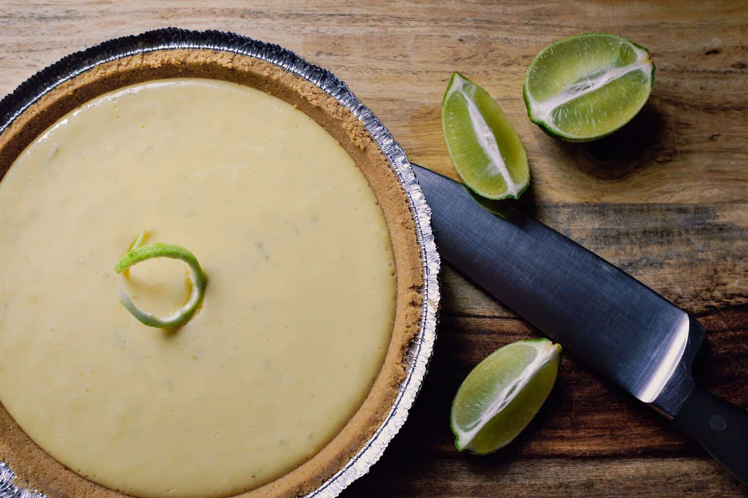
Not my actual celebration treat.
And, in case you are wondering. I did have cake (Key Lime Cheesecake, to be precise) for SupersizeLIFE’s blogiversary. It also happened to be my birthday. My very first blog post launched on the day I turned 50. Wow! A lot has happened in two years.
And so much more will happen in the next two. I hope you will continue to stay along for the ride.
Links to Referenced SSL Blog Posts Above:
- The Power of a Mastermind Group
- Fredericksburg in Texas Hill Country
- What is a Supersize LIFE and a Supersize LIFE Blog?
- Giving Up Greece


Wow, quite a lot of work upgrading your site! Thank you for such a good explanation of what you did and why.
Thanks, Karen. I’m never sure if readers will be interested in this level of detail when it doesn’t have to do with RV life. But it’s part of my life now so I thought there might be some interested in the “behind the scenes” of a blog. Maybe this wouldn’t be so BIG to me if I didn’t start my website the exact same way I started RVing–no experience, no knowledge…just desire and determination. There have been plenty of learning bumps along the way. For both.
I sooooooo love the new color scheme. Way more vibrant and alive! Good makeover! Lil sister agrees, so you may move forward <3
So glad I have the approval. I love the colors too. Glad you like them.
I loooooooove keylime cheesecake! That’s what I chose for my last birthday cake too! I knew we were friends for a reason.
Your new site is wonderful, Debbie, congratulations! I know how much hard work you put into it.
Now, the next time we see each other we’ll have to have Key Lime Cheesecake. That’s a good thing to have in common. Thanks so much. And, of course, I love the logo work you did for me. I’m so happy with the way it came out and am excited to find different ways to use it.
I love the new colors. your new photo and quills new photo. See you soon. Love, Marie
P.S. I have a new email.